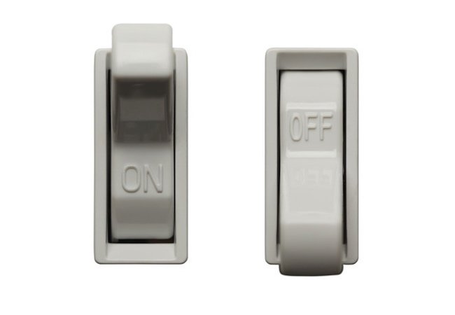
Bored of using the plain pre-defined switch design? Let’s see how we can change it.
The Switch or Toggle is a widget that defines the state of a button between 2 values: selected and not selected, although typically is used to define the ON/OFF state. On Android you can use:
SwitchCompat.From the Appcompat library, is a subclass of CompoundButton.SwitchMaterial.From the Material library, extends from the SwitchCompat. [Update: deprecated from v1.7.1 to MaterialSwitch to follow naming convention of MaterialButton and MaterialCardView]
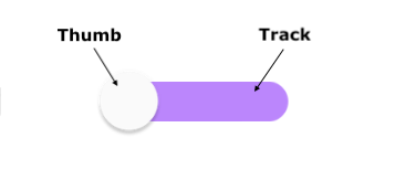
Anatomy of the switch:
But what if you don’t want the style that comes by default? What if you want to customize it? Well, let’s see how we can approach it:
Step 1: Add the switch to your activity/fragment xml
<androidx.appcompat.widget.SwitchCompat
        android:id="@+id/customSwitch"
        android:layout_width="wrap_content"
        android:layout_height="wrap_content"
        android:layout_marginTop="42dp"
        android:text="@string/switch"
        android:textSize="16sp"
        app:switchPadding="10dp"
        android:checked="false"
        app:layout_constraintTop_toBottomOf="@+id/titleText"
        app:layout_constraintStart_toStartOf="parent" />
Step 2: Add a drawable for the track
Create a drawable file, let’s name it “switch_track”, add <selector> as its root element and here we’ll define 2 more drawables for its false and true state:
<selector xmlns:android="http://schemas.android.com/apk/res/android">
    <item android:state_checked="true"
        android:drawable="@drawable/track_on"/>
    <item android:state_checked="false"
        android:drawable="@drawable/track_off"/>
</selector>
The true/false drawable states are going to be the similar, the difference will be the icons to display for each one of them (if you want a more sharped angles, you can remove the radius attribute):
- For track_on.xml:
<layer-list xmlns:android="http://schemas.android.com/apk/res/android">
    <item android:state_checked="true">
        <shape android:shape="rectangle">
            <gradient
                android:startColor="@color/purple_200"
                android:endColor="@color/purple_700"/>
            <size android:width="20dp"
                android:height="9dp"/>
            <corners android:radius="20dp"/>
        </shape>
    </item>

    <item android:drawable="@drawable/ic_music_on"
        android:right="77dp"
        android:left="18dp"
        android:top="7dp"
        android:bottom="8dp"/>
</layer-list>- For track_off.xml:
<layer-list xmlns:android="http://schemas.android.com/apk/res/android">
    <item android:state_checked="true">
        <shape android:shape="rectangle">
            <solid android:color="@color/purple_200"/>
            <size android:width="20dp"
                android:height="9dp"/>
            <corners android:radius="20dp"/>
            <stroke android:color="@color/purple_200"
                android:width="1dp"/>
        </shape>
    </item>

    <item android:drawable="@drawable/ic_music_off"
        android:right="18dp"
        android:left="77dp"
        android:top="7dp"
        android:bottom="8dp"/>
</layer-list>
Why do we add a layer-list on above examples? Because we want to shape the track and we want to add an image to it, so we would need for that a list of drawables represented by the <item> element.
Step 3: Add a drawable for the thumb
Same process as with the track, create the “switch_thumb” xml file and add the custom drawables with the <selector> as root element:
<selector xmlns:android="http://schemas.android.com/apk/res/android">
    <item android:state_checked="true"
        android:drawable="@drawable/thumb_on"/>
    <item android:state_checked="false"
        android:drawable="@drawable/thumb_off"/>
</selector>
And let’s define the true/false states:
- For thumb_on.xml:
<layer-list xmlns:android="http://schemas.android.com/apk/res/android">
    <item android:state_checked="true"
        android:top="2dp"
        android:bottom="2dp"
        android:right="2dp"
        android:left="2dp">
        <shape android:shape="rectangle"
            android:dither="true"
            android:useLevel="false" android:visible="true">
            <solid android:color="@color/white"/>
            <size android:width="15dp"
                android:height="9dp"/>
            <corners android:radius="20dp"/>
        </shape>
    </item>
</layer-list>- For thumb_off.xml:
<layer-list xmlns:android="http://schemas.android.com/apk/res/android">
    <item android:state_checked="true"
        android:top="2dp"
        android:bottom="2dp"
        android:right="2dp"
        android:left="2dp">
        <shape android:shape="rectangle">
            <solid android:color="@color/white"/>
            <size android:width="55dp"
                android:height="24dp"/>
            <corners android:radius="20dp"/>
        </shape>
    </item>
</layer-list>
Step 4: Add your custom drawables to the switch
Now that we have created our xml files, we need to reference them in the switch through the attributes app:track and android:thumb:
    <androidx.appcompat.widget.SwitchCompat
        android:id="@+id/customSwitch"
        android:layout_width="wrap_content"
        android:layout_height="wrap_content"
        android:layout_marginTop="42dp"
        android:text="@string/switch"
        android:textSize="16sp"
        app:switchPadding="10dp"
        android:checked="false"
        android:thumb="@drawable/switch_thumb"
        app:track="@drawable/switch_track"
        app:layout_constraintTop_toBottomOf="@+id/titleText"
        app:layout_constraintStart_toStartOf="parent" />
It should look like this

Now you’re ready to customize it! Thanks for reading.
You can find a sample here GitHub


Comments